
Alphabet soup development
After
collecting a body of research I started developing my letterforms. I narrowed
down my reference images and started generating concepts that I did some basic
sketches of. I had two main ideas that I wanted to explore further, so started
producing some examples. The brief stated that we where to produce a sequence
of ten letterforms that explore and communicate the word that I selected. One
restriction we were give was that the letterforms had to be hand produced and
in black and white.


Firstly,
I explored using the font called ‘Mission script’ that was mentioned in my
research, I printed off the alphabet in capitals as they are easier to work
with than lower case letters. Next, I traced the letterforms ready for adapting
them to communicate my word.
I
decided that I wanted to experiment with creating letters like the exploding
ones by skyrill.com.
I first filled in the traced outline of the letter with Indian ink, before the
ink dried I blew it forcing the ink to run sporadically everywhere. This was supposed
to imitate an explosion associated with a ‘BOOM’ despite achieving this the ink
obscured the letter shape hence making it illegible. Therefore, to overcome
this problem I re-illustrated the letterform in white.
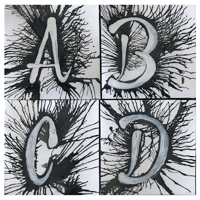
Above are four example letters that I produced in the
exploding style. I believe that the outcome communicates an explosion well, and
I am happy with the achieved result. However, I don’t think that these letterforms
portray my selected word accurately enough. The immediate meaning of the word ‘BOOM’
is a ‘A loud, deep, resonant sound.’ Therefore I want
to further my development and produce a new set of letters.
Firstly,
I decided to experiment with using a different typeface, as I believe that
‘Mission script’ did not suit the definition of the word boom very well.
Moreover, as I am now experimenting with using sound waves to portray my
letterforms I need to use a simpler bold font. Therefore I decided to use ‘Gabo
Drive’ as mentioned in my research. I had already sketched some basic concepts
of how I would produce the letters so started producing the letters
immediately.

Another
restriction that was stated in the brief was that the delivered letters had to
be in ten by ten centimetre squares, much a like in our summer brief. Before I started
producing the type I measured the squares out in my sketchbook and worked
straight onto these. I worked in black pen, which enabled me to produce the
letters ready for presentation; this technique also enabled me to work at a
quick pace. Below is the alphabet I created.

A - D

E - H

I - L

M - P

Q - T

U - X

Y - Z
No comments:
Post a Comment