
Today, we received a brief following on from the set of
posters we produced regarding a news story that we researched. My story was
about the false media claims that Fidel Castro is dead.


The brief asked us to create a ‘mail shot’ that disseminates
our message to an appropriate mailing list. Therefore, I need to produce a
visually appropriate envelope design, resolution to fit within the envelope,
and an aesthetically appropriate mailing list.


I started my design process by producing diagrams that
explored ideas and different design decisions.
My first diagram explored different decisions regarding the
envelope design.

KEY POINTS
- A limitation of the brief is the envelope size. We are restricted to a 'DL' size, that measures 22x19.9 excluding tabs.
- I need to consider how my resolution will fit into the envelope.
- I need to produce a template of the envelope to work on.
- I want to keep a similar theme to the previous posters to continue to strong on-going theme.
- I will use the same colour ways as my last set of posters.
- The envelope will need room for an address and stamp.
- The stock will be the same as the posters and resolution.
- When producing the envelope it will need to be printed at A3 size.
Secondly, I looked at decisions regarding the resolution
design.

KEY POINTS
- The resolution can be no bigger that width of A4 however it can be as long as needed.
- Double sided printing could be used.
- The resolution could be folded so it becomes an envelope.
- Same theme will be used
- Same fonts that were used on my previous set will be used.
- I will print on the same stock as the envelope.
- The resolution must inform the audience instantly Fidel Castro is alive.
- Will mix type and illustration.
Finally, I produced a diagram for the mailing list.

KEY POINTS
- I need to research into Castro's allies and friends as this is who I want to inform.
- I want to keep the mailing list in context with my other designs, so I will continue the same theme.
- I will produce the document at 2:1 dimensions, the same used for all my posters so far.
The
diagrams enabled me to explore different ideas regarding the mail shot. With a
strong idea of how I could design the mail shot I started generating design
variations. I first experimented with design variations of the resolution, as I
think that this will be the most time consuming aspect of the project. The
design sheets enabled me to explore possible outcomes that could be produced.


To
conclude, compared to my last set of posters these designs more detailed and
experiment with different compositions. Regardless of this I have ensured that
they include aspects of my initial poster designs, such as the central stripe,
triangle and boarder. This helps the audience notice that they belong to the
same set when presented next to each other. Additionally, I have decided to
include a patterned background, inspired by Shepard Fairey’s posters. Moreover,
I have placed Castro’s illustration within a circle, this gives the
illustration a clean edge so when placed into composition it is easy to work
around.
Next, I produced the design variations for the envelope.


Finally, I produced the designs for the mailing list.


To conclude, it
is important that the envelope share the same characteristics as the poster. Therefore,
I have adapted the same base designs as used on all of the posters. This ensures that the envelope has a strong,
consistent theme and relevance to its contents. I have experimented with
different layouts, changing the position of the stamp and address to discover
the best position. Finally, the design sheets also helped me generate ideas, I will
include a small illustration of Cuba that will be placed on the front of the
envelope to show its origin.
Finally, I produced the designs for the mailing list.


I produced my
mailing list last as I knew that it would take the least amount of time to
produce because of its content. The mailing list must be visually appropriate
to the poster and envelope. Therefore, I will utilize the same base design once
again. The mailing list will display the addresses of Castro’s friends and
associates, and will display this information in a visually engaging way.
After
I had completed my design sheets and selected my strongest designs I started digitally
producing my mail shot. I set up CYMK documents as all of the outcomes will be
printed. Moreover, I produced the poster first as it will be the most time consuming
element of the brief to produce because of the complexity of the design. I set up the document at 2:1 format in conjunction with the briefs limitations.
Firstly, I started
by creating the base for the poster. The base took aspects from the designs of
my past posters, for which the concept was the Cuban flag.


I continued creating an identical base to the ones
previously used until I introduced the coloured background, my previous posters
in the past had only ever had a centrally placed line. The decision to make
this change came when I was creating design variations for the poster.
Moreover, I then created the circle in which the illustration of Fidel would
sit. I used a combination of the ellipse and pathfinder tool to minus the
circle shape from the solid blue background.


On my design sheets I mentioned experimenting with a patterned
background so started researching into different patterns and shapes. It was very important that these were
relevant to the theme and concept of the poster, therefore I researched into patterned
tiles that were used in Cuban architecture.
Based
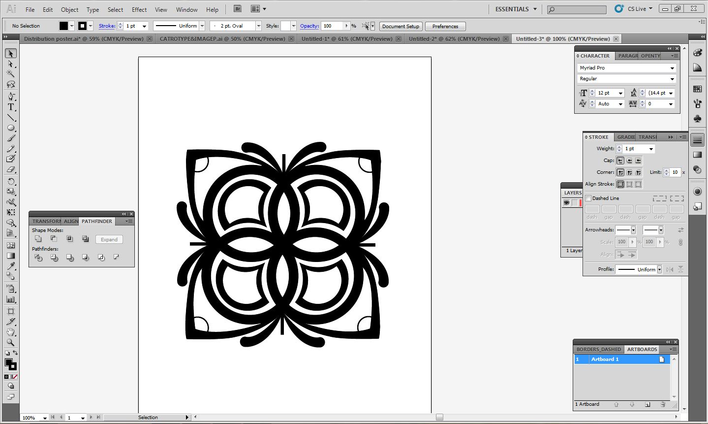
on the Cuban tiles that I looked at, the designs always seemed to revolve around
circles, curved lines and floral influenced decoration. I wanted to achieve a
similar type of look so started my pattern by overlapping four circles. I continued to play with different shapes and adaptations until I created the designs seen below.


Once the base design for the pattern was complete, I created
a grid of patterns to fit the dimensions of the block blue background. Once I had
this placed correctly I used that pathfinder unite tool to merge all of the
patterns. Now, minus front tool could be used to remove the pattern from the
background.


I now had the background completed, so I placed the
illustration within the circle and added the central blue line that is an
essential part of the design in ensuring a consistent theme. The illustration
in the circle had left quite a lot of negative space due to its low
composition. To overcome this I placed lines radiating from behind Castro,
these also grab the audience’s attention and focus it on the image.

Finally,
I was happy with the visual quality and layout of the poster so started
developing the type. I wanted the poster to be straight to the point, therefore
involved a limited amount of text, focusing only on how Castro is alive despite
claims from the media.


I then created my Envelope design, as I was unsure to the exact
measurements I had to research to find them. Once I was sure I had the
correct measurements I created the net for my envelope. I set up guides on illustrator to ensure that my design stayed relatively Symmetrical.


Once I had the net measured correctly I started adding
colour, first to the tabs. It was very important that the colour scheme matches
the previous posters exactly, or they would look disjointed as a set. I copied
the triangle from my initial poster designs and used the eyedropper tool to
copy the exact colour.

The
final proposal from my design sheets used a similar concept to the poster set,
utilising a design adapted from the Cuban flag. First, I placed the red layer
of colour on the net. I wanted the triangle aspect of the design to be on the
back of the envelope with the blue lines flowing round to the front. Therefore,
there is plenty of room for the address and stamp.

Next, I placed the blue layer of colour on the design. In all of my posters there is a gap between different elements of the design, such as the circle and background on my newest poster. I wanted to continue this theme as it separated the colours and gives the poster depth. Therefor, I made sure there was a gap between the edge of the envelope and the blue lines.


I
now had the completed base design, ready for the address and stamp
placement. I used a rounded cornered
rectangle and the pathfinder tool to make a space for the address to be placed.
Then, using the ‘Blanch’ typeface previously used on my type poster, I added
the first address. On the brief it stated that one of my editions should be
sent to the University by post therefore, I used the college email first.

I
wanted to give my envelope a different dimension, as it looked rather plain
with just the address placed on the front. To further reiterate the Cuban theme
I decided to include a small illustration of the country, as well as a small
stamp to show the date the letter was sent.
After finding an image of Cuba I used the pencil tool to
draw round the outline. As I used the pencil tool some of the detail was lost
however, this did not pose a problem as the illustration is being printed at a
small size.

I used the pathfinder tool to unite the country and smaller
islands, making them one vector shape. I then could use the pathfinder tool
again to remove the shape form the blue stripe.


I then produced the stamp. I decided to keep the design and its content simple, I achieved this by creating the base out circles and straight lines and only including relevant information.


Finally,
I used the same technique as used on my Cuba illustration to unite all the
aspects of the stamp design. Next, I used the minus front, pathfinder tool to
extract the stamp from the central blue line. The letter was now ready to be
printed and produced.

Finally, I started the design for my mailing list. This was relatively quick to produce as it utilised the same base design and typefaces as all my other posters.
I
started the design by re-creating the base design used throughout both message
and delivery briefs. The design had to be scaled down as the mailing list is
being produced at 2:1 format at A4.

Next,
using the display font ‘Cubano’ I created the title for the mailing list, placing
the type centrally allowed the type to follow the composition of the
triangle down towards the main content of the piece.

After
adding the central stripe, I added the five addresses to the piece. I used the
font ‘Blanc’ for the text as it reads well at a smaller size compared to my
other two fonts. The text is centred in accordance to the pieces composition.

After
the addresses were placed the mailing list was finished.

FINALS


CRITIQUE


The most important points that were made concerning my projects progression regarded producing my mailshot and adjusting my envelope dimensions. Up till this point in the project I had been focusing on the production of my poster and envelope. The envelope and poster hold the most importance need to be finished in time to be sent in the post. Moreover, they will form the content of the mail shot, therefore need to be produced to a high standard of visual quality.
It was also noted that my envelope dimensions were slightly off, when I researched into why this was I discovered that there was a slight re-sizing of the when sending to print. I overcame this by adjusting the print settings so this did not happen.
No comments:
Post a Comment