


I started the brief by highlighting my points of interest from my research into Scientology, I also listed other points of interest that stemmed from my research topic. Once I identify my point of interest I will collect further research and decide what my outcome will be.
Points of interest
L. Ron Hubbard.
L. Ron Hubbard was the founder of The Church of Scientology, he single handedly created the religion and many of its rules and regulations. In my research I discovered publications that stated Hubbard was a pathological liar, who eventually could not differentiate between his lies and reality. This man was quite a character, and is the founder of what is undoubtedly a very powerful organisation, he has an interesting past that I doubt people will know about. A possible outcome could be to inform the general public about the founder of Scientology, explore his life and his creation of the cult.

Dis co nnec tion
Disconnection is a practice that The Church of Scientology strongly enforces, it entails cutting ties with family members and acquaintances that the Church feel are a threat. The disconnecting process is very traumatic for people who endure it, there are countless accounts from ex-members of the Church among other evidence to show that disconnection can be, and often is forced. A possible outcome could inform the public, and people interested in joining the Church about this damaging practice.

XENU
The story of Lord Xenu is a very touchy topic among scientologists, and when mentioned in an interview with Tommy Davis, spokesman for The Church of Scientology, he claimed that the stories surrounding Xenu are 'disgusting perversions of Scientology beliefs'. Only top level scientologists have access to the Xenu story, which is covered up and lied about. In my research I found accounts and evidence to support the fact that the story exists. A possible outcome for this point of interest could be an educational book on Xenu and his exploits. I want the book to inform people about the Xenu and have a comical tone, as the story is unbelievable and ridiculous.

Cults
After conducting a large body of research into Scientology I came to the conclusion that the religion is actually a cult. Personally I find this topic very intriguing which is why I am listing it as a point of interest. Further research would need to be conducted into the topic as my research only focused on Scientology. I would aim to inform the general publuc about different modern day cults, and lift the veil of mystery that surrounds them.
Next, I created design sheets exploring possible outcomes for each point of interest. I hope that exploring some ideas will help me decide what point of interest I will focus my project on.


Point of Focus
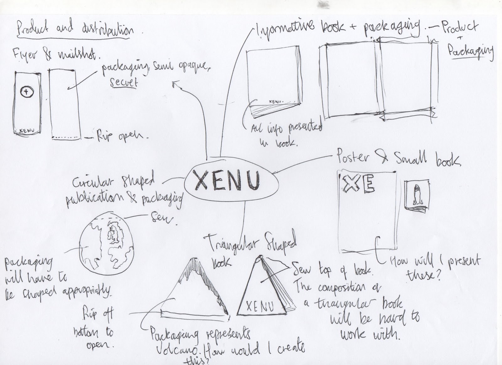
While exploring the possible outcomes it became apparent which point of interest I wanted to focus on. The story of Xenu is a top Scientologist secret that I think the general public need to know about. My outcome will take the form of product and distribution, the product will be an informative book. Moreover, I will also design suitable packaging to house the book while it is distributed. I want the book to be informative, but have a comical tone running throughout. Additionally, I want the book and packaging to be aesthetically appropriate and visually engage the audience.
Now I have defined my point of focus as the story of Xenu I will conduct further research into the topic. Furthermore, I will also research books and packaging as my outcome will be taking this form.
During Fridays session we had to present our start on the new brief, we were giving sheets to fill in that defined what we plan to produce, who our target audience is, what the function of the product will be and how it will interact with the audience. I completed the sheet with relative ease and quickness as I have already refined my initial ideas.
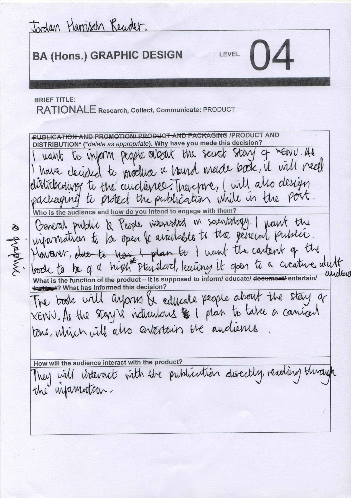
I have an informed opinion of my outcome and target audience, moreover after collecting a body of research I have plenty of ideas about how I should create my book and packaging. As my outcome is aimed at educating the general public it will need to be aesthetically interesting to grab their attention instantly, otherwise the product runs the risk of being overlooked. Moreover, the infographics will have to communicate the facts and information in a simple, instantly understandable way, as the product is being produced for a wide audience communication is vital to the products success.
Time Management
I made time management sheets to help me organise my project, as when reflecting on past projects time management has been an issue. I made the basic layout in illustrator, therefore I can use the sheets again in the future.


Considerations
Theme
I have based the theme of my book around circles, as they are a good representation of the spherical shape of a planet. I will have a consistent circle elements running throughout the publication creating a strong visual theme running thought.
Colour Scheme
Type
When the book is finished it will be a6 in size, I need a typeface that has a lot of different fonts and is readable at around 8pt. I chose to use Helvetica as it has a good range of weights and fonts that can be adapted to suit all aspects of my publication.
Colour Scheme
As the rest of my books design has modernist influences I have decided to keep my colour theme relatively formal. Therefore, I will use a grey scale pallet when designing the elements for the publication.
Type
When the book is finished it will be a6 in size, I need a typeface that has a lot of different fonts and is readable at around 8pt. I chose to use Helvetica as it has a good range of weights and fonts that can be adapted to suit all aspects of my publication.

Stock
Due to the clean, formal theme I am following I will print onto a gloss type paper. Textured papers create an aged look when printed on, and this is not what I am trying to achieve.
I used a commercial printing website to research into possible stocks.
I used a commercial printing website to research into possible stocks.
80# Gloss Text
Standard glossy paper stock, about as thick as a light magazine cover. The shiny finish provides an excellent opaque base for rich process color printing. This is our most popular type of stock for Brochure printing, Catalog Inserts, Flyers, Posters, etc.
100# Gloss Text
Similar to the 80# gloss text, but 25% thicker and heavier, for a more substantial feeling piece. Standard Uses: Brochures, Information Sheets, Self-mailers, Posters, Door Hangers, etc.Design sheets
Book design


Final
From my initial ideas I have decided to produce deign three. It features a protective sleeve in which the publication would sit. The sleeve uses a clever closing method, using sting to fasten it shut, although this is impractical for reproduction, it continues the hand-made feel I want my book to achieve. Moreover, the cover will be cut so that it reveals the logo placed on the cover of the book, this is a representation of the exposing content of the publication.
Packaging Design


Final
When designing my outer packaging I needed to consider its purpose. The packaging had to be suitable to send through the post, but keep in theme with my books content. I have decided to produce the above design, which uses tracing paper as stock. This will not be as protective as other forms of outer packaging however, it dosen't need to be, as the sleeve will be protective. With this in mind I chose this design as it further reiterates the fact that the story of Xenu is a secret, as the packaging will be translucent, the audience will not fully be able to see the publication until they rip open the packaging.
Logo Design


Above are digital versions of some of my initial logo designs. I was aiming to produce a logo that is really simple as I am going for a minimal theme with my book, I chose to develop the logos that I felt communicated an aspect of the Xenu story. I believe the middle spaceship and the bottom alien design are strongest as they communicate the fact that Xenu is from OUTER SPACE!
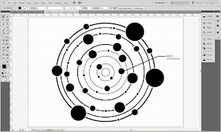
Moreover, I also experimented with my 'space circle' concept. I decided spray-paint would be the best media to use. I first made a stencil to create a clean edge for the circle, then using white paint I applied a layer of dots. The circle that was most successful used less dots than the others, also the mist from the paint created a nice clouded effect.


I have decided to use the space circle on the cover of my publication, it gives a good insight to Xenu and the origins of the story and Scientologist beliefs. Moreover, I will use the middle spaceship design if a relevant logo opportunity presents itself.

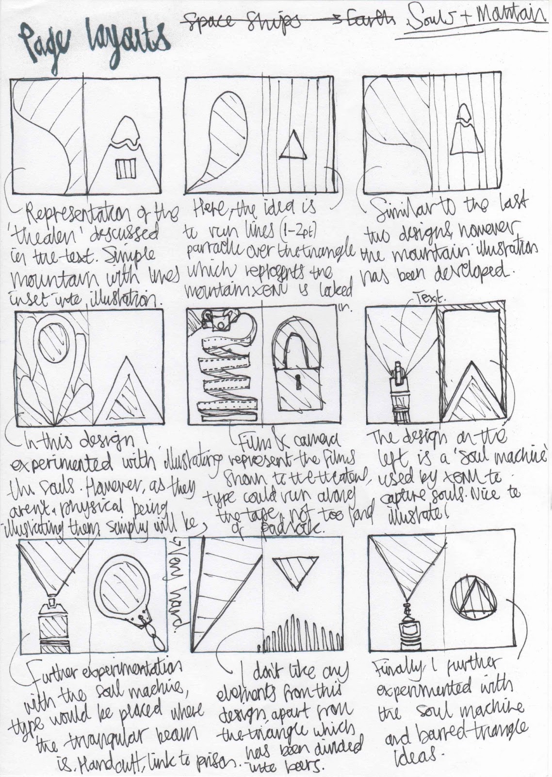
Page Layouts


Models
Above is the design process of my mock book. I managed to stiching each signature in correctly, but I faced some issues with how loose they were binded. Moreover, the cover fit the books dimensions well, I am going to remove the bottom tab as the book will be glued to the cover when properly produced. Finally, the idea of using rivets and string to secure the front cover didnt work. The rivets were too loose in the paper so fell out, also the back of the rivet was too long and stuck into the book. Instead I will produce my final with a hole-punch and eyelet.
Below are the final images of my second model book. This time the pages have the finished illustrations and refined information, and have been printed double-sided. The cover has been produced on thick black card stock and tests the closing method used to hold the publication closed. Due to printing restrictions the book was printed on the wrong stock, as this has a textured surface the readability of the text was affected. When creating my final book the correct stock will be sued.
Design Development (digital)


I developed my designs digitally using Illustrator.


I then transferred the elements of the book from Illustrator and into InDesign, where I had an a6 sized document set up.


No comments:
Post a Comment