
LIVE BRIEF INFORMATION
Recently, while speaking to a close friend about art, design and our progression since college I was asked to create a logo and business card design. My friend Richard (Ricky) is an artist from South Africa who specialises in working with oil paints, often depicting beautiful images of wildlife and the human form.
The brief is very relevant to my design practice and will make a good first brief for my responsive module as the project is only small and so should be completed relatively quickly. Furthermore, logo design is something that interests me as a designer but is an area in which I haven't got much experience, and so the brief also offers me the opportunity to experiment with logo design.
The conversation detailing his requests is displayed below;


Unlike other briefs there was no need to re-write brief or generate ideas as the outlined request is so straight forward, both the form and aesthetics of the product have already been defined by the client, meaning that the only thing left to do is the production.
Although I am blogging this project as part of my responsive brief I actually undertook it before the module started. Therefore, time management was not a big issue as I had no other on-going work and plenty of time to create my response. Despite this I aimed to complete the project as quickly as possible to ensure that the client received the work as soon as possible.
DESIGN DECISIONS
After receiving the brief I started to think about the design decisions that need to be made before progressing with the initial design stages of the project. As I am producing a logo based around the Fibonacci spiral design decisions relating to the different typefaces I want to apply are is the only design decision that need to be considered.
TYPEFACES
I started the project by selecting a range of typefaces from which I plan to select two to work with. As Richard has not set me any limitations with regards to the fonts used I want to send him two typefaces with opposing aesthetic characteristics. Then, when receiving feedback on the initial logos I will assess which is the most appropriate in achieving the desired aesthetic appearance.
Below are images showing the initial typefaces ranges I made my selection from;
SCRIPT FONT SELECTION;
SANS SERIF FONT SELECTION;
CHOSEN TYPEFACES
The first font that I selected is a typeface called 'Mission Script' which is a brush style script front with a similar aesthetic appearance to fonts used on old typographic signage. The font was chosen due to

The second font that I chose to utilise when creating logos is called collator and was selected because.... and its stark contrast to Mission Script. The font holds an imposing appearance with its tall x-height and wide letter forms.....

DESIGN PROCESS
INITIAL DESIGNS
After selecting a choice of typefaces I started sketching out some rough designs to explore aesthetic form and typographic placement. After creating a collection of logo designs I outlined what I believed to be the most successful ones, refining the selection to three main designs. Once the three designs had been selected I worked digitally recreating each logo while applying the typefaces previously selected.
SKETCHES
Below are some images of my initial sketches, as the client had already outlined what he wanted producing there was not much room for experimentation.

FINAL LOGOS
After designing a range of quick thumbnail designs I selected my favorite and started developing them at a larger size. Below are some images of the final logo designs that will be developed digitally.

DIGITAL
Below are a selection of images displaying digital renderings of the three final logos. The logos were produced quickly as rough guides for Ricky to review and criticise, if he likes any of the three then I will spend time developing the logo to a suitable standard.


REFINEMENT PROCESS
After designing a small range of digital logo variations I was ready to show Ricky the progression made so far. As he is currently living in South Africa any conversations regarding the project were held online.
From the digital selection of logos displayed above I selected two of the strongest designs to send to Ricky. I believe that sending only sending a few variations is important as if you send the client a large selection of logos there can be so much choice and the client can find it hard to select a logo they really like.
From the digital selection of logos displayed above I selected two of the strongest designs to send to Ricky. I believe that sending only sending a few variations is important as if you send the client a large selection of logos there can be so much choice and the client can find it hard to select a logo they really like.
The conversation below documents the process of receiving criticism on the two designs;

FEEDBACK
- Text diagonal.
- Up market, formal design.
Example sent;


- Make the 'R' clearer.
Below is the refined version that was sent to Ricky after receiving feedback on my initial designs.

I also experimented with adding a textured gradient to the logo at the request of the client.

As the project progressed one thing became clear, communicating via the internet about specific visual aspects of a design is hard work as its not always easy to understand what the client wants. I believe that because of this the form of communication the refinement process engaged in was drawn out much longer than it needed to be.
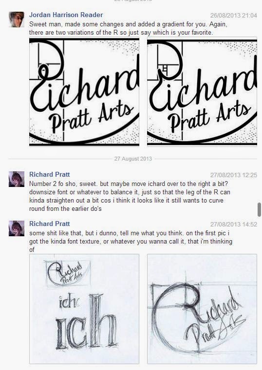
FEEDBACK
- Logo version two - preferred.
- Move the 'ichard; over to the right slightly.
- Straighten out the leg of the 'R'.
- Texture applied to font

Below is an image displaying the scanned in version of the refined hand-drawn logo.

I scanned the hand rendered logo in at 300dpi and used the 'Live Trace' tool in Adobe Illustrator to create vectors of the design. Once the design was vectorised I overlaid the textured gradient featured on previous designs.

Below is the client feedback received on the new, hand-rendered logo versions.

FEEDBACK
- Render the 'R' in a similar font to the rest of the type.
- Less hand drawn - more solid.


FEEDBACK
- The lighting on the new curved 'R' is wrong.
To save time I used the light box again to trace the basic design and then refined the texture appropriately. Furthermore, the addition of an arrow indicating the light direction helped me when creating the improved version.

With the addition of the refined 'R' and a slightly increased line weight the logos aesthetics were vastly improved making the outcome appear much more engaging and professional.


FEEDBACK
- Round the spiral (top of the R) a bit more.
After much feedback and many refinements the logo was finally perfected to an acceptable standard and ready for submission.


FINAL LOGO
After much feedback and many amendments the logo was finished to a standard the client was really happy with, an image of the final logo can be seen below.

CHROME VERSION
As part of the live brief Ricky also requested that I create a chrome version of the logo for a print run of acetate stickers he hopes to get produced as part of his identity. To create the chrome version of the logo I uploaded the Illustrator file to Photoshop and applied using the bevel and emboss tool.

SUBMISSION
When submitting the logo to Ricky I put him together a file containing both RGB screen and CMYK print versions of the logo. During our conversations he mentioned that he plans to use the logo on both printed and screen based outcomes, and so varying file types were essential.

I was unsure as to what software the client would have on his computer and so in the pack I ensured that both Illustrator files, PDF's and JPEG. images were all included so he would definitely be able to access the files. Additionally, when sending the files to Ricky I wrote out a quick and simple explanation describing the differences between RGB & CMYK file types and how they should be applied.

No comments:
Post a Comment