
Each group had to pick out three random slips of paper from one jar, and one piece from another, this ensured that each group had a randomly selected location and three random words. The three words were to be used to help develop the concept, however, only one word could be chosen and used to develop the concept.
My group selected the choices below;
Venue - Hotel
Words - Cloud, Match, Staple
Below are some considerations we need to consider;
- Clients Needs.
- Who is the audience?
- What is the purpose?
- How will the concept reflect these?
After receiving our randomly selected choices we made spider diagrams from the three random words, during this process we aimed to create as many associated terms as we could think of, as it will help when developing the concept at a later stage.
Below are the mind maps we created;


We reviewed each diagram to define which word has the most relevant phrases generated, of the three, my groups decided that 'cloud' had the most applicable terms. Therefore, we selected it as the word that we would use to help develop our hotel concept.
Next, we created another spider diagram to help define our target audience.

We decided to focus on a more mature business orientated audience, as we believe that a vast majority of people visiting and staying in Leeds do so on business trips and other commercial jobs. Other clients that could also want the services offered by an upmarket hotel could include celebrities and affluent people.
After defining the audience we used the 'cloud' spider diagram to generate names for our upmarket hotel.
Name choices;
- Cloud 9
- Shade
- Silver lining
- Stratus
- Atmosphere
- Ozone
Next, we started building up information needed to develop a strong, relevant concept, the diagram below explores specific features and phrases related with luxury hotels. Furthermore, words that were generated such as 'elegance' and 'Luxury' later helped influence our choices regarding the style of identity.

Next, we made a list of outcomes that could be produced as part of the hotels identity;
- Logos & Signage.
- Business Cards.
- Letter heads & Stationary.
- Restaurant Menu's & affiliated media.
- Hotel wayfinding.
One key to successful branding is to have consistent visual elements running across all outcomes. Therefore, before writing up our concept we created this spider diagram to help define these specific aesthetic qualities.

CONCEPT;
Hotel (bar & restaurant)
Name - stratus. Relates to a type of cloud.

Stratus Cloud - Link
Target Client - Mature, wealthy, business minded professionals.

Wealth is not affected by age, which is why we did not specific a specific age group. - Link
Hotel Ethos - Comfort, quality, luxury, security, relaxation, elegance
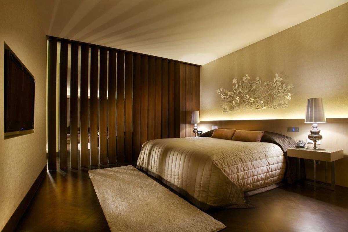
Aesthetic Of Brand - Formal colour scheme, minimalist layouts, silver foiling, smart uniforms, elegant logo, a swimming pools in the shape of a clouds.

LOGO
Finally, after defining the specifics of our concept we started to generate possible logos for the hotel. We decided to start by producing a script style font as its characteristics linked to the elegant aesthetic we wanted to achieve.
One member of the group created the 'S' variation seen below the bold stratus logo, the letter looks like a 'H' when looked at from an angle which holds relevance to our chosen venue. We discussed the icon as a group and decided to develop it as a logo variation or small stamp symbol. I began to develop the icon, aiming to make it more rounded and cloud like. However, I believe this altered the icon too much, affecting its legibility and making it less relevance.

Some of my initial concepts.
Roxy created some really effective script style logo variations, and therefore was tasked with developing one of the designs into a final logo.


The final logo ready for presenting.
Finally, after creating some visual outcomes we looked at different Pantone swatches that could be applied to the logo and other products.

PRESENTATION
(add)
CONCLUSION
I found the concept session really helpful as it helped cement my understanding of a concept and how they should be developed. Furthermore, presenting our finished concepts helped to give us an insight into what it will be like when presenting concepts to proper clients in industry.
No comments:
Post a Comment