
HISTORY - The History of The Internet.
- Created in 1991 at Cern.
- Tim Burners-Lee is a British computer scientist who is know for inventing the world wide web.
- Scientists at Cern were looking for a way to quickly send information to each other.
- The internet initially only existed at Cern but soon grew world wide.
- All websites are hosted on web servers.
- Steve Jobs invented the 'NEXT' computer which was the worlds first web server. It initially hosted all the available websites on the web, which meant that if powered off, the world wide web would just shut down.

- In 1992 the first ever image was uploaded onto a website.
- For images to be hosted on the web they needed to be in a specific format such as png. or jpeg.

The first picture on the world wide web - Link
TERMINOLOGY - Language
- Http - Hyper Text Transfer Protocol.
- URL - Uniform Resource Locator.
- HTML - Hyper Text Markup Language. Used when designing websites.
- CSS - Cascading Style Sheets.
- FTP - File Transfer Protocol.
- CMS - Contect Management System.
The adobe program 'Dreamweaver' is used for the actual designing of a website.
HTML & CSS are used to design and build websites.
SKEUOMORPHISM
Skeuomorphism is a term that relates to the realistic actions and images used on the web, such as e-books that require the page turning and buttons that actually look like real buttons.
Skeuomorphism examples;
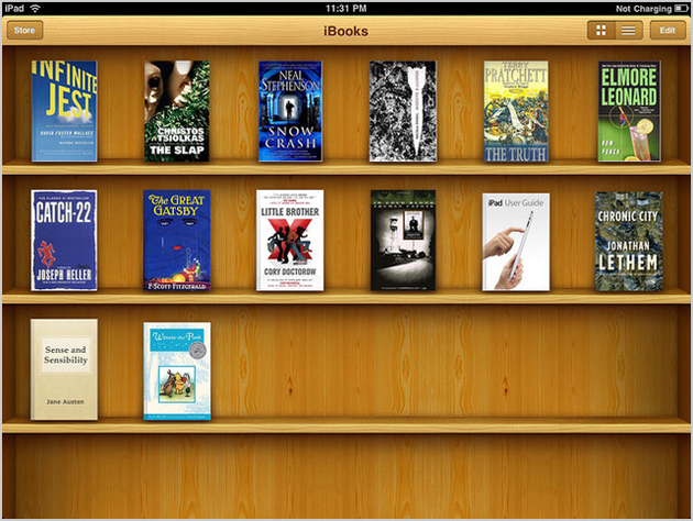
Apple utilize skeuomorphism in many areas of their product interface. Above is the app 'ibooks' from which you can select and read digital e-books, notice that all the digital publications are placed on a realistic looking bookshelf .

Another fine example of skeuomorphism from apple.
A skeuomorph is a derivative object that retains ornamental cues from structures that were necessary in the original.
RESPONSIVE WEBSITES
Responsive web design (RWD) is a design approach that aims to craft sites that provide an optimum viewing experience, this helps with navigation and readability.
- Designing for web is still fresh and developing.
- Web trends only usually last a few months before becoming outdated.
- Responsive websites can be adapted to a variety of media with varying screen sizes. This helps when opening a website using a smart phone rather than a computer.
- The responsive website concept was developed by Ethan Marcotte.

DESIGN CONSIDERATIONS
When designing a website these considerations should be reviewed to ensure the outcome is functional and relevant to its target audience.
- What is the point?
- Why design the website?
- What is the websites purpose?
- Who are the target audience?
- What information will the website communicate?
READING LIST
We were also given a list of useful books that will help us understand and improve our website design;
- 5 Simple steps - E-book.
- HTML and CSS: Design and build websites By John Wiley & Sons.
- A Practical Guide To Designing for the Web.
WEBSITES
Moreover, Simon also provided us with a list of useful websites;
- www.awwwards.com
- webdesignerledger.com
- fivesimplesteps.com
- aisleone.net
- www.piccsy.com/everything-design/
Finally, we finished the session by looking at various websites examples and noting down our initial feelings.
APPLE WEBSITE;

- Minimal.
- Vibrant.
- Focus put on product.
- Easy to navigate.
LEEDS COLLEGE OF ART WEBSITE;

- Boring.
- Uninviting.
- Formal.
MY OWN BIKE WEBSITE;

- Classy, upmarket feel.
- Well composed.
- Focus on product.
- Inviting.
No comments:
Post a Comment