

- Produce a practice investigation that explores your own critical observations, thoughts and opinions relating to the context of our developing practice.
- Visually communicate informed findings through the selection, evaluation and presentation of appropriate primary and secondary research.
- Identify why you are interested in the outlined theme and what I want to find out about it.
- Identify specific and relevant research activities.
- The response should reflect our understanding of the theories, principles, concepts and processes explored through the module so far.
- The research collected in response to the study task so far should for the basis of a practical and conceptual investigation of content, format and media in relation to the audience.
- Resolution can be print based, screen based or web-based, 2d, 3d or 4d.
- The resolution could explore the relationship between a range of media formats and products or focus on one method of delivery.
- Consider the boarder social, cultural, political and historical contexts of the subject while exploring their relationship and relevance to our personal practice.
- The format of your final resolution should reflect our increacingly specialist understanding of design and our own creative concerns.
RE-WRITING THE BRIEF
After initially reviewing the project brief I started the second part of the module by re-writing the brief to make it relevant to the subject matter I researched into. Re-defining the briefs information is an important part of the project as it allows me to organise information and develop an original and relevant response to the module.

THE BRIEF
Create a piece of communication that can be distributed to parents of primary school children informing them about the manipulative practices of corporations and advertisers.
CONCEPT/PROPOSITION
Create and produce a printed form of communication that utilises an infographic style design to communicate important information to the audience. The outcome should inform the audience about the techniques applied to manipulate child consumers and also highlight the negatives associated with doing so.
BACKGROUND
Corporations employ advertisers who utilise a number of techniques to manipulate consumers buying habits and desires. A large segment of their target audience consists of young children and teenagers.
TARGET AUDIENCE
Parents with children in primary school living in Britain.
TONE OF VOICE
Formal, Informative, Serious
CONSIDERATIONS
- How will the flyers contents engage the audience?
- Will it be taken seriously by parents or just ignored?
- Do parents know about the existing and ongoing manipulation of children?
- Are parents aware of the negatives associated with child based consumers?
- How will the design appeal to parents with varying ages?
MANDATORY REQUIREMENTS
- Physically printed outcome.
- Body of supporting primary & secondary research.
- Supporting development work & blog posts.
DELIVERABLES
- Physically printed outcome.
ASSESSING THE SUBJECT
Before I started formulating my physical response I reviewed the contents of my essay highlighting specific areas of importance and interest that could influence the form and direction of my practical outcome.

- Corporations apply various methods to condition kids and create a generation of compliant child consumers.
- One of the consumer markets key to prolonging the capitalist society is children
- Children hold much importance as they possess considerable immediate spending power, exercise a significant influence over household expenditure choices.
- By conditioning children at a young age corporations are able to inset a consumerist ideology that will stay with them throughout their teenage years and into adulthood
- Through the study of psychology advertisers are able to understand how children’s brains work and what causes their upmost desires.
- Technological devices such as the TV and computer are often the tools choice of utilised by advertisers to engage with their audience
- 85 per cent of children’s favourite websites collect some sort of personal information
- Corporations have the ability to utilise spy software known as ‘cookies’, which are placed onto children’s computers by host websites and company advertisements.
- The absolute invasion of privacy practiced by corporations is known within the industry as ‘market research’.
- Parents have no idea their children are being exposed to such manipulative schemes.
- To overcome the underhanded techniques utilised by the industry children must be educated about the systems used to manipulate them.
- By creating child consumers corporations inset a consumerist ideology which stays with the child as they grow into an adult - prolongs system of capitalism.
PROJECT DIRECTIONS
After analysing the essay I crated a mind-map exploring different ideas relating to possible directions the project could be taken in. When creating ideas I continually assessed how each one is relevant to the audience, the environment in which it would be shown and how it could communicate the desired information.

- Anti-advertising kit - Introduces consumerism and manipulative techniques utilised by advertisers, also includes anti-consumerism posters and spray-paint for revolution style advertisement vandalism.
- Anti-advertising poster campaign - Series of posters disseminating information about the negatives associated with consumerism, the posters would also feature information relevant to the manipulative techniques used by advertisers.
- Parents guide to protecting children from capitalism - Introduces parents to consumerism and the techniques utilised by advertisers to manipulate their children's commerce based desires, allows parents to fight back and protect their kids.
CONCEPT
The mind-map allowed me to explore and assess a range of possible directions for the project. The selection of ideas was refined to three finals from which I selected my final resolution and project direction.
When analysing the three possible possible project directions I assessed the relevance of ideas against the target audience to define if the idea was suitable for development. Selecting an informed idea that is directly relevant to the outlined audience is important as it will allow me to create a useful outcome that has a realistic application and use.
After analysing the three responses I defined my project direction and developed my response to the brief.
CHOSEN IDEA;

WHY CHOSEN;
- Introduces parents of children directly affected by advertising to the ideas covered in the essay.
- Allows parents to educate children and help protect them against manipulative advertising schemes.
- Form of outcome means that it is easy to distribute to parents in the street or school yard when collecting children.
- Form also allows information to be digested while on the move - appropriate for busy parents.
- Simple form allows for mass production of design - nation wide distribution scheme.
- Supporting posters could also be created to capture the attention of parents/children.
RESEARCH
Once I had defined a concept for the project I started progressing towards the physical production of the piece by collecting a body of primary and secondary research. When collecting research I tried to collect information from a balance of primary and secondary sources. However, due to the nature of the project the most relevant research was collected from primary sources in the form of an interview.
Aesthetic research link - Link
Parental survey research Link - Link
Teacher interview research link - Link
DESIGN DECISIONS
After collecting a body of research I felt I was informed enough about the projects contents, audience and consequent considerations to start making decisions relating to the outcomes aesthetics and form.
TYPEFACES
The first decisions defined for the project relate to the typefaces that will be applied to the flyer. As I plan to mainly utilise typography to communicate the leaflets contents selecting a range of cohesive, relevant fonts is very important to the success of the final outcome.
PRIMARY
Initially, I was going to utilise the secondary font named 'Kalinga' for both the headings and body copy to create visual consistency across the leaflet. However, upon experimenting with the font I noticed that the typographic hierarchy was hard to define and they titles often did not have much aesthetic influence. Therefore, I decided to define a new primary font for the headings featured on the outcome.
A font named 'Franchise Bold' was outlined as the new primary font as the letterform aesthetics are bold and imposing and will help to establish a clear hierarchy. Additionally, the rounded caps of the letters makes the font seem inviting and friendly which is useful in engaging the parental based target audience with the leaflets information.

SECONDARY
The secondary font is names 'Kalinga' and comes in two variations, bold and regular. The bold variation of the typeface will be utilised for subheadings as the slightly differing form of the fonts will help to establish a clear typographic hierarchy and guide the audience through the leaflets contents.
The typeface was selected due to its simplistic, proportionate form. The balanced nature of the font helps it to achieve a high degree of legibility while retaining a soft appearance that helps to create a friendly, inviting aesthetic.


COLOUR SCHEME
Next, I defined the colour scheme for the flyer. Selecting a range of appropriate colours is a very important aspect of the project as they will help to define the aesthetic appearance of the whole leaflet.
As the outcome is aimed at parents but discusses the well-being of young children I decided to utilise quite a bright, playful colour scheme. The concept behind the choice of colours relates to the content of the leaflet, as it is based around children, advertising and products I decided to apply a colour scheme that reflects the nature of both kids and the colourful products often marketed at them. Moreover, aside from the relevance to the leaflets content the bright colour scheme will also help to create an aesthetically engaging outcome that parents will want to investigate further.

FORMAT (SIZE)
As outlined in the concept the outcome will utilise a leaflet based form due to its functionality and relevance to the audience.

STOCK
The final design decision I outlined for the project relates to the stock that the leaflet will be printed onto. From the selection of paper stocks available in the library I chose the bulky newsprint as the stock choice for the project.
The paper was selected for a number of reasons. Firstly, the weight of the stock was perfectly suited for the function of creating a leaflet, the paper was not so heavy that the flyer would be hard to fold and remain closed and not so light that it felt tacky and cheap.


CONTENT WRITE-UP
After defining my design decisions I reviewed the information highlighted in my essay and composed the type for the flyer. When creating the body copy I reworded important aspects of the essay adding relevant aspects when appropriate.
Before I started creating the body copy however first listed the individual sections that will feature in the leaflet and help to disseminate information about the campaign to parents.
LEAFLET SECTIONS;
- Introduction.
- Why are children targeted?
- What is the outcome of exposure?
- What techniques are used?
- Protecting your children.

Final word count - 1159.
INITIAL LAYOUTS
After defining the design decisions and writing the content for the leaflet I had all the necessary elements to start progressing with the initial design aspects of the project. The process of design was started by creating a range of possible layouts for both side one and two of the leaflet.
SIDE ONE LAYOUTS;


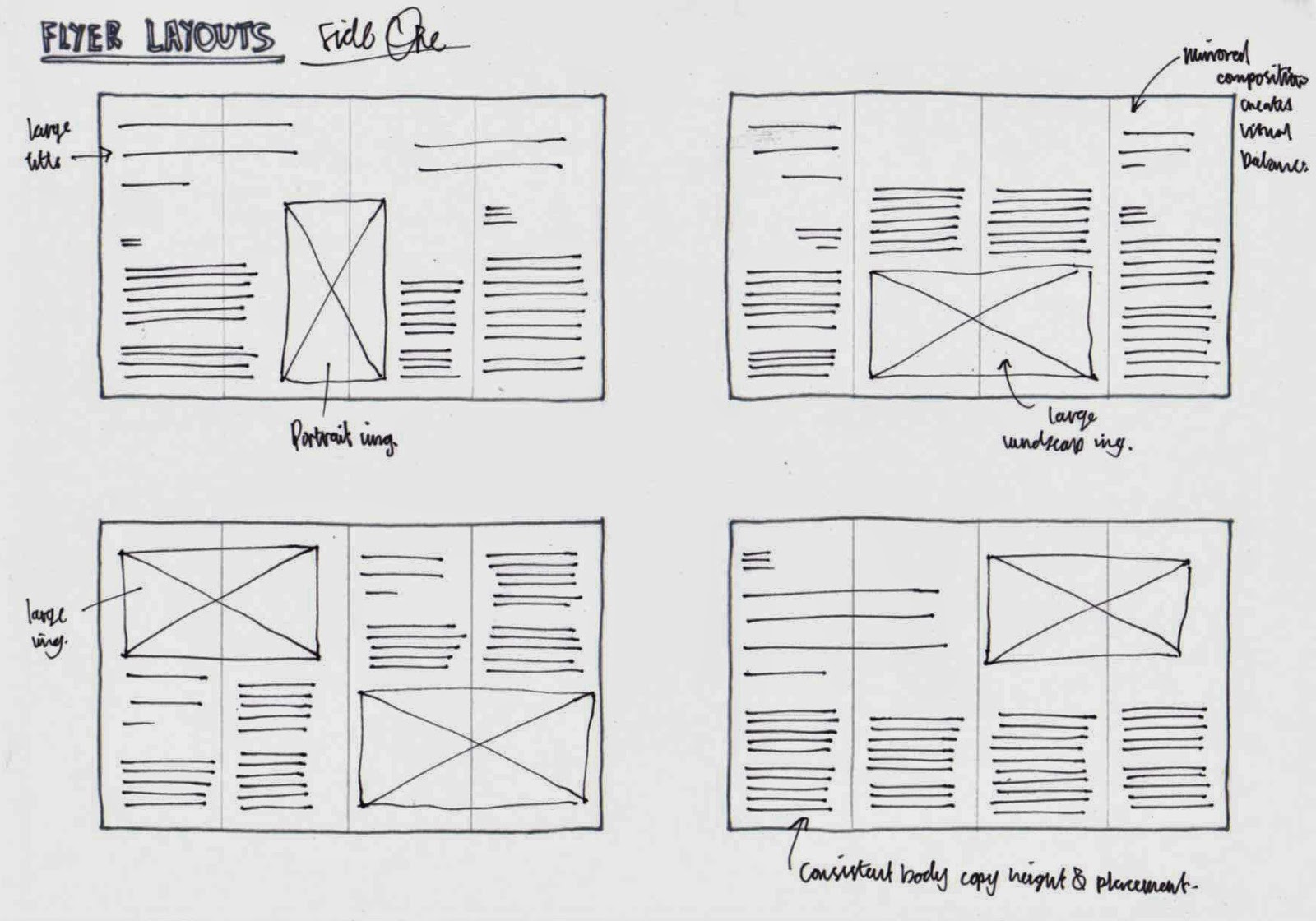

SIDE TWO LAYOUTS;


DEVELOPED LAYOUTS;
Once I had create a variety of layouts I reviewed and refined the selection creating a developed, final page composition for the leaflet.
SIDE ONE

SIDE TWO

COVER ILLUSTRATION PRODUCTION
Once I had finalised my design decisions and layouts I progressed with the initial production stages of the leaflet. The process was started with the creation of the cover illustration, I decided to focus the design around an image of a young child as the target audience will be able to relate to the image.
The base image was first opened in Photoshop.

The Liquefy tool was used to manipulate the child's eyes to make him look hypnotized, this relates to the effect influential advertisements have on children.


Once the eyes had been adjusted I used the Colour Halftone filter and adjusted the screen angles to create a simple black and white halftone version of the child image.


Once the halftone image had been created I transferred the design into Adobe Illustrator and used the Live Trace tool to create a scalable vector version of the image, this was an essential part of the process as it allowed me to scale the illustration to the correct size without pixelation.


After vectorising the image a few slight adjustments were made to remove the rest of the halftoned background.
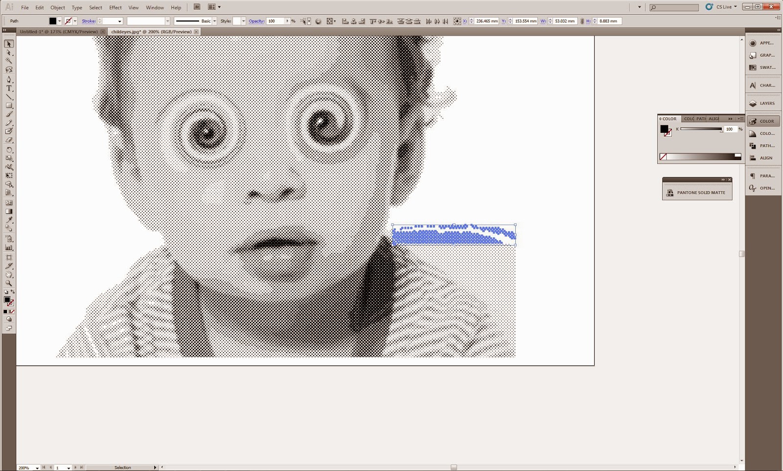

Finally, I adjusted the colour levels so they matched the black outlined in my design decisions.

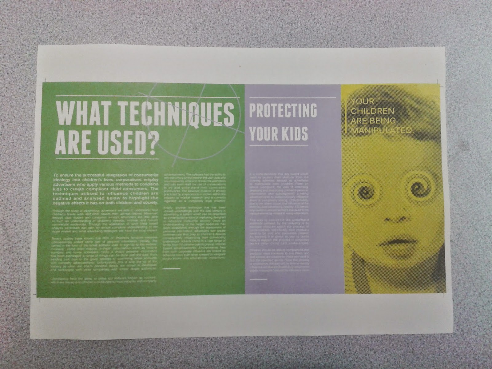
FLYER DIGITAL PRODUCTION
After I had created a scalable version of the halftone illustration I started progressing with the additional production of the leaflet.

A 20 x 10 grid was used to help me arrange the various elements of the leaflet.

After creating the grid the backgrounds were added using the colours outlined in my design decisions.


Initially, I had not outlined a header font and was going to utilise the bold version of Kalinga. However, upon reviewing its impact I decided to go back to my design decisions and outline a new, attention grabbing primary font.


Due to the amount of information featured in the 'Why are Children Targeted' section of the leaflet the middle pages were combined into a double page spread.

Adding the bar-code illustration allowed me to refine the layout to make it more balanced and appealing.


The pages were also combined for the 'What Techniques are Used' section.


TYPESETTING
As I decided to utilise justified paragraphs to create a clean, modern aesthetic a lot of the type had been automatically typeset by Indesign meaning that some lines had too much space and others too little. Unfortunately, this affected the legibility of the body copy, therefore I reviewed each page of the leaflet and refined the typesetting manually.


MOCK UP LEAFLET
After finalsing and refining the digital leaflet design I decided to print a full colour mock up version to check the quality of the outcome before progressing with printing the final outcome.
The overall design was problem free however one of the colours looked vastly different to how they appeared on screen even with the print overview setting applied. Despite the colour difference, I decided not to refine the colour selection as I printed the mock-up leaflet from the printer in studio 2. As I am printing the final in the digital print room with James I plan to take the leaflet and see what advice he has to offer.

The mock-up was trimmed and folded using a scalpel, metal ruler and bone folder to create an accurate representation of the final outcome.


Upon reviewing the mock-up I noticed that on side two of the leaflet the placement of the coloured backgrounds did not match up with the fold lines which assume this is because the printer in studio two doesn't print double sided accurately. I will check the placement of side twos backgrounds against side ones to see if I am correct or if I have inaccurately positioned the backgrounds.

BACKGROUND REVIEW
Upon inspecting the backgrounds on the Indesign file I found that they were accurately placed meaning the imprecise placement was the printers fault, therefore no adjustments were made to the design.

FINAL OUTCOME
When I went to the digital print room to print the leaflet I spoke to James and showed him the mock-up version I had previously created, I mentioned how the colours were vastly different to those shown on screen and asked if the colours needed adapting slightly. However, James informed me that it was infact the printer that was used to create the mock up and that the colours produced by the printers producing the final outcome will be much more accurate.
Below are images documenting the final printed outcome after it had been trimmed and folded.
No comments:
Post a Comment