
LIVE BRIEF INFORMATION
I was recently approached by one of my friends called Jake Slater who is currently in the process of setting up his own recruitment firm. His company will specialise in working with local businesses to find them suitable employees for any job opportunities that they have. Often, businesses do not have the spare time to conduct numerous job interviews until they find the right person for their team which is where Jake's firm come into play. His company offers businesses a service that finds them the right person for the job without the hassle and expenditure of doing it themselves.
As a new business the company needs a recogniseable identity that reflects their service and professionalism and so Jake has asked me to help him develop a company logo and a set illustrations to go on the businesses website. The illustrations created will be featured on the company website and represent the varying business packages the company will offer.
Although there is scope for a complete branding and identity project for the company the client simply requested the logo and illustration outcomes. Personally, I believe that a complete cohesive identity would benefit the company in making it come across more professional and inviting. So, although the client is currently looking for no further work I plan to propose a complete branding project with supporting explanations detailing why the company would benefit from the additional work.
During our preliminary talk the client gave me some basic ideas he had in mind for the logo;
- Simple form - maybe just type.
- Propose some icon style logos too.
- The icons should represent the company - selecting the right person for the job.
- Pastel colour scheme.
- Graphics created need to be simple, modern and recogniseable.
The client also gave me a website he found very inspiring which can be seen here;
Website Link - Link
INITIAL IDEAS
After reviewing the brief details listed by the client I started generating logo ideas through the use of a mind-map. Once complete, I reviewed the information generated and highlighted ideas that had the most relevance to the company the logo will represent.

HIGHLIGHTED IDEAS;
- Crown - best/king, links to hierarchy.
- Magnifying glass - Searching for employees.
- Ticked box - Right person for the job.
- Cog in machine - Right person for the job.
- Jigsaw piece - Right person for the job.
- Hands shaking - Deal sealed, professional.
DESIGN DECISIONS
Next, before progressing with the project and creating some logo variations I first had to define the relevant design decisions such as the colour scheme and typefaces that will be utilised when digitally creating the outcome. When talking with the client he gave some rough feedback as to the kind of aesthetic he wanted to create which helped to influences the decisions made.
COLOUR SCHEME;
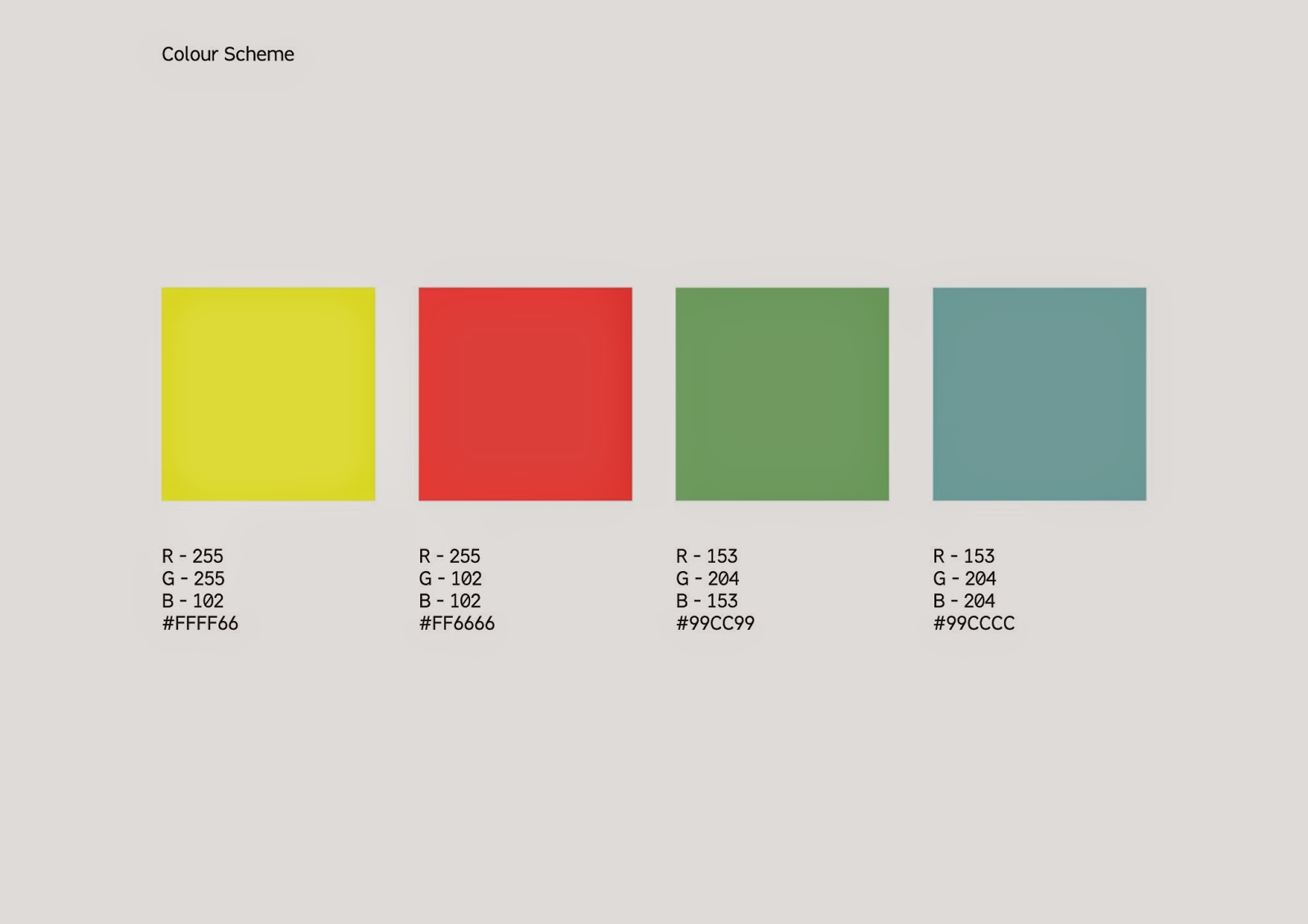
When talking to the client about the specifics of the work he wants creating it was mentioned that he wanted to utilise a pastel colour scheme to create a friendly aesthetic. Therefore, when selecting colours I chose a collection of bright, inviting colours similar to the ones utilised on the Heckford Advertising webpage that was sent to me as inspiration. By selecting a range of pastel colours I can ensure that my outcome achieves the desired look described by the client.
The image below shows the chosen colours with the supporting RGB colour codes.
TYPEFACES;
FONT CHOICES;


CHOSEN TYPEFACES;
From the selection of typefaces initially outlined for the project I decided to refine the selection to a final two fonts that will be applied to the logo variations during the digital development stages of the project. One of the reasons I chose to do this was to ensure that the client was not overwhelmed with choice when selecting a logo from the variations presented.
Typeface One;
WHY CHOSEN;
- Balanced letter proportions make the font both legible and readable.
- Simplistic appearance applies to aesthetic choices outlined by the client.
- Formal appearance of the typeface is professional yet inviting.
Typeface Two;
WHY CHOSEN;
- Balanced letter proportions make the font both legible and readable.
- Simplistic appearance applies to aesthetic choices outlined by the client.
- Formal appearance of the typeface is professional yet inviting.
INITIAL DESIGNS
Using the mind-map of ideas initially created for the project as inspiration I produced a quick set of hand-drawn logo variations. From this selection I chose around five logo forms to develop digitally.

- Develop typographic logo variations using outlined typefaces.

- Develop dot logo - Represents finding the right employee.
- Develop jigsaw logo - Represents finding the right employee.
- Develop crown logo - Illustrates that the company is the best - hierarchy.
- Develop magnifying glass logo - Links to searching aspect of the job.

- Develop medal logo - Illustrates that the company is the best - hierarchy.
DIGITAL PRODUCTION
Once I had designed and refined a range of thumbnail logo variations I continued progressing with the project by digitally developing a range of variations with the outlined fonts and colour scheme.
Once I had designed and refined a range of thumbnail logo variations I continued progressing with the project by digitally developing a range of variations with the outlined fonts and colour scheme.
Type based logo variations;

Medal & Magnifying glass logo variations.

Dot logo variations;


Jigsaw logo variations;


Crown logo variations;


FINAL DESIGN SHEETS;
After creating a large range of logo variations I arranged to have another meeting with the client to discuss the projects development so far. Before attending the meeting I reviewed and refined the selection of digital logos creating logo sheets to display to the client while discussing ideas. The creation of these sheets is an essential part of communicating with the client as they allow me to present a selection of refined ideas while explaining the relevance of each one.
The images below display the sheets presented to the client;
CLIENT MEETING
At the meeting with the client I sat down with my laptop first displaying the two font choices and colour scheme. After presenting the fonts and chosen colour scheme to the client I progressed to present and explain each logo design, talking about the aesthetic decisions made and their relevance to the company.
During the meeting any important points of feedback were noted down and recorded so that I could assess the points covered at a later date.
NOTES;

- Colour scheme perfect - just what the client imagined.
- Bebas font preferred due to weight variation.
- Both dot and jigsaw icons were a big success with the client.
- Fabrica font preferred from font selection.
- The outlined colour scheme will be applied to the website.
- Send outlined logos with changes made to client asasp.
RESPONSES;
After reviewing the list of notes taken during the meeting with the client I formed a list of responses to help me progress from the meeting;
- Prepare colour scheme with supporting RGB colour codes for web developer.
- Bebas font was liked because of the weight version but Fabrica font was preferred from the two - develop weight variation for Fabrica font.
- Put together logo pack with outlined logo variations.
SENDING FILES
During the meeting with the client it was outlined that he wanted the variations discussed sending to his email address as soon as possible. I was informed that he was meeting with a web developer named Alex to discuss the specifics of the company website and wanted to take the colour scheme information and logo to him for visual references. Therefore, after preparing the colour scheme and making the outlined changes to the Fabrica font I put together a logo pack containing all relevant files.
Dropbox was used to disseminate the logo file to the client as the program allows users to store and download multiple files online and distribute access links to people of their choosing. Due to these characteristics the program is perfect for sending work to clients.


Supporting the logo file disseminated via dropbox I also composed an email which was sent to the client explaining the specifics of the folder and files contained within.

PROJECT ON-GOING
Despite the end of the responsive module the live brief is still on-going as I am working on producing a series of illustrative icons for the clients website.
Over the summer I hope to arrange another meeting with the client in which I will propose my further involvement with the companies branding. As mentioned earlier in the post, the client is currently not looking to develop a complete cohesive company identity. However, I am hoping that my proposal presentation will change this view.
No comments:
Post a Comment