
After collecting a brief body of secondary aesthetic research I progressed with the project by defining what will be produced as part of my personal identity. I reviewed my research notes and looked at what other designers have created to represent themselves, assessing whether the outcome would be relevant to my personal identity.
After this process I create a spider diagram exploring the design outcomes that could form the individual elements of my personal identity. The elements highlighted in red are the aspects that will be produced as part of my final outcome.

WHAT COULD BE PRODUCED;
- Business card.
- Personal Logo.
- Stationary.
- Poster tube.
- Invoice.
- Letterhead.
- Envelope.
- Thank you note.
- Portfolio booklet.
- Website.
Additionally, I also created a subsequent spider diagram exploring what I want the outcome to communicate about me, my beliefs and practice. Creating the diagram was an important part of the design process as it allowed me to define certain decisions relating to aesthetic choices and content.

ASPECTS TO COMMUNICATE;
- My love for craft.
- Personal manifesto - communicates what I believe in.
- Sustainability.
- Hand drawn outcomes.
- Love for Print!
- Interest in nature.
IDEA DEVELOPMENT
After defining the elements that will be produced as part of my outcome I created a series of individual sheets exploring each outcome in more detail. This process was useful as it allowed me to visualise each element and get an idea of the types of aesthetic that could be applied to them. Additionally, the sheets also presented me with the chance to define how the individual elements of the personal identity will come together to form a cohesive outcome.


DESIGN DECISIONS
After defining what will be produced as part of the project and working through each individual elements to help me gain a better understanding of how it could be produced, I was in a position where I could start progressing with the aesthetic development of outcomes.
The process of development was started by first defining the design decisions that will be applied to each individual outcome of the identity. Defining the design decisions is an important aspect of the project as they hold relevance to each aspect of the outcome and will help to form the cohesive identity I desire.
COLOUR SCHEME
The first design decision that was defined related to the colour scheme that will be applied to elements.
When defining the colours of the colour scheme I wanted to choose a pallet that represented an aspect of my design practice. As I am an ethically driven designer looking to create sustainable design solutions I outlined a colour selection of natural hues that can be found within the outdoors. Consisting of a dark brown and selection of greens the colour scheme clearly reflects the sustainable, nature based theme that I want to communicate.

TYPEFACE - BODY COPY
The next design decision that was defined related to the typefaces that will be applied to each individual element of the branding.
As I want to create an identity that represents me but is totally unique to other self branding projects I decided to create a personal display typeface that will be applied to all of the individual elements of the project.
As the primary typeface will be created by hand I only needed to outline a font for the body copy. While collecting my secondary based aesthetic research I came across a project by Passport that utilised a mono-spaced font, the outcome was clean, legible and create a really engaging aesthetic. Therefore, I also decided to utilise a formal, mono-spaced font as I believe it will create a nice visual contrast to the hand-rendered elements of the project while ensuring information can be read by readers.
A font called Courier New was selected as it is mono-spaced font that also has serifs which help to ensure the text is both legible and readable at smaller sizes.

STOCKS
When thinking through the project I decided that I wanted to print onto a full range of recycled stocks to reflect the sustainable, ethically focused nature of my design practice. However, unfortunately, due to the short timescale that I have to complete the project combined with a limited amount of funds the idea was unfortunately unachievable. Therefore, a selection of standard stock was selected from the library to form the paper range my outcomes will be printed onto.
When choosing stocks I was very careful to select a range of matt surfaced, naturally coloured papers to help achieve the organic aesthetic reflective of my practice and personal interests. Additionally, as mentioned when assessing the aesthetic research collected for the project, having stocks that contrast each other with dark and light tones will help to create an engaging visual aesthetic. All of these aspects were taken into consideration when choosing the range of five stocks.
A grey card stock was reclaimed from the college before it was disposed of in the recycling for my business cards.
The five individual stocks consisted of;
- Black sugar paper.
- Grey sugar paper.
- Brown sugar paper.
- Antique paper.
- Bulky newsprint.

PERSONAL DISPLAY TYPEFACE
The images below document the creation of my personal typeface, the basic letterforms were created by hand so that the outcome was rough and represented the hands on approach I often take with projects.
The first step of the font was to create the basic letterforms, as I was working to such a tight timescale with the project I did not have time to design each individual letterform myself, so instead utilised an existing font as a base font.
The monospaced font named 'Consolas' was used as the base font for my typeface as the letterforms are legible due to their simple, formal form. To get the basic outline of each letter I utilised my window as a lightbox and traced the alphabet in regular and bold.


Two lines of the regular letterforms were traced onto one sheet to form the regular and alternate letterforms of my hand-rendered font.

When creating the alternate letterforms I added extra cross bars and small visual additions to letters as a representation of...

Once each letterform had been traced I used a fine liner to trace and colour each letter.


The same process was completed for the numerical letterforms as well as the punctuation and symbols.

SCANS
The image below show the initial, hand rendered letterforms after being scanned in ready for the digital development process.


DIGITAL DEVELOPMENT
After creating the hand-rendered base letterforms of my personal typeface I scanned each font in at 300ppi and used Adobe Illustrator to vectorise each letter.


Once vectoirsed the letterforms were scalable and could be edited.

Small adjustments were made to certain letters to refine them of any small anomolies created during the live tracing process.


FINAL LETTER FORMS
The images below displays the final, vectorised regular, alternate, numerical and symbolic letter forms of my personal font. The typeface is not yet completely functional as it does not type and so each letter has to be placed individually. I plan to make the font functional in my spare time over summer.
As I was working to a tight timescale I only produced the regular version of the typeface to save myself time and allow me to progress with more important aspects of the project.


LOGO
The concept for my logo is based around creating an original, recogniseable logo that allows me to stand out from the crowd. As an up-and-coming designer I need to stand out from the competition when looking for jobs and agencies, and with so many logos existing it is challenging to think of a concept that has not already been created and recognised on a large scale. Additionally, I also wanted the logo to be a visual representation of me and my style of work, combining all of these aspects into a logo based outcome was very challenging and pushed me creatively to generate a strong concept.
The logo creation process was started by first scanning in different parts of my hands at 500ppi, scanning in at such a high resolution allowed me to zoom right in on the computer when developing a pattern.

A graphics tablet was used to ensure that I could accurately trace the contours of the lines.


After tracing over what I believed to be the most interesting parts of my handprint I removed the hand image and cut out circle crops from each of the patterns.


The removed circles were then placed onto a single sheet so I could assess which ones were the most successful.

The selection was refined to these two outcomes.
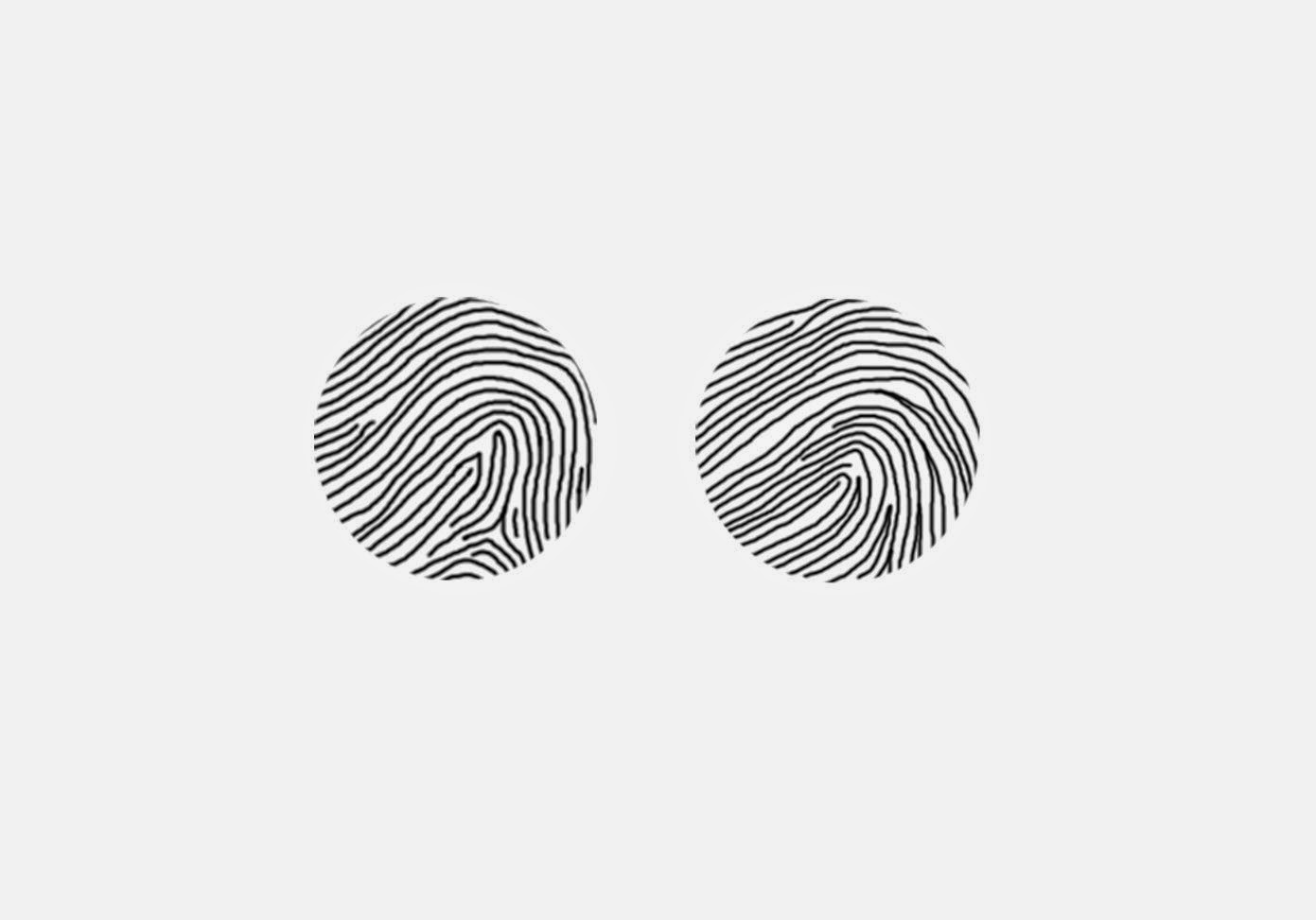
Next, I decided to trace the two outcomes and hand render each pattern to create the hand-rendered aesthetic that will run across all the individual elements of my project.


Of the two final outcomes I selected the variation seen on the right for further digital development.

The hand-rendered outcome was then scanned in and placed into illustrator where it was vectorised and cropped to a neater circle shape.


LOGO VARIATIONS
Once I had a vectorised version of the logo I started progressing with creating logo combinations with my typeface and logo icon.


FINAL LOGOS
The selection of logos was refined to three variations that can be applied to different aspects of my outcome. The reason behind creating variations of the logo lies with experience gained from past projects, sometimes when only one variation is created it is not always suited for the size or location it needs to be placed. Creating logo variations with varying forms allows me to surpass this problem.


ORDERING THE STAMP
After creating the icon I immediately utilsed 'The English Stamp Company' to order a stamp of the logo.
As mentioned when analysing the visual research I wanted to create a stamp of the icon so that it can be placed onto all of the individual elements of the branding and for a consistent visual. Additionally, stamps rarely print perfectly, and I think the imperfect aesthetic of the stamp will fit perfectly with the rest of my branding visuals.
The logo icon was scaled and sized to 36mm in diameter and then ordered from the site. One of the main reasons I chose to use the site was because of the free postage service and expected one day delivery time.


LOGO ICON STAMP
The stamp came in just over 24hours and upon first testing it I was very happy with the outcome as it achieved the exact aesthetic imagined.
Upon receiving the stamp I added parallel lines to the bottom and side to ensure I could place it accurately when stamping the various outcomes of my identity.

PATTERN
After creating the logo stamp I progressed with making the repeat pattern that will be applied to various aspects of the project such as the inside of the envelope and reverse side of the letterhead and invoice.
The sheet below shows my initial exploration of patters and icons.
* It should be noted the swastika is at a 90 degree angle, representing its original meaning of "well-being" - the symbol was unfortunately later angled at 45 degrees and its peaceful meaning perverted by the Nazi's.

From the initial pattern sketches I created a hand-rendered pattern which was then scanned in to create the repeat pattern needed for the project.

DIGITAL DEVELOPMENT
The pattern was scanned in and vectorised in Illustrator allowing me to then refine and scale the outcome to create the final piece.


ENVELOPE
Once I had developed the pattern that will be utilised on the envelope insert I progressed with the production of the envelope itself.
The process was started by first defining the dimensions of my envelope, to help me get a rough idea of these I measured the dimensions of a standard A4 envelope I had in my possession.

DIGITAL DEVELOPMENT
Once I had the dimensions defined for the envelope I progressed with the digital creation of the rough net.
The form of my envelope has changed from the initial deign created at the start of the project, this is mainly due to the fact that the patterned inerst would not be showcased very well using the form initially outlined. As the patterened insert is an important visual feature of the envelope I decided to develop the form so it could be showcased better.


Aspects were added to the envelope such as one of the logo variations and my personal contact information.


PATTERN PLACEMENT
Before digitally printing the envelope and insert I first had to crop the hand-rendered pattern previously created.
The black box represents the area of which the insert will cover.


Vector shapes and the pathfinder tool was used to crop the pattern to the shape of the insert.


PHYSICAL PRODUCTION
After the envelope and insert had been printed out they were cut with a scalpel and glued together using spraymount.

LETTERHEAD & INVOICE
The next aspect of the project that was developed was the letterhead and invoice. The two project elements were combined and produced together as they shared a similar form and function. Additionally, as the two elements were so similar I decided to utilise one consistent layout for both the letterhead and invoice.
INITIAL DESIGNS
Below are the initial layout designs created for the outcomes, each one explores a different composition of page elements such as the placement of the logo and contact information.


DIGITAL DEVELOPMENT
After creating the basic layout variations I reviewed the choice and selected a layout to utilise on both outcomes.

A 15 x 20 grid was used to ensure that I arranged elements precisely.

As I progressed with the digital production certain aspects of the layout were changed and developed to create a more balanced outcome.


The invoice table was created by hand to help keep the hand-rendered aesthetic consistent across all design outcomes. Additionally, once vectorised its size could be adjusted freely without warping the outcome.


Once the table had been added text detailing my terms & conditions or service and payment terms was added to the negative space down the left hand side of the invoice.

After creating the invoice I produced the letterhead which was quick and easy to due as it utilised the same basic layout as the invoice.

Finally, the lines of text were typeset to ensure there was no large spaces to effect aesthetic appearance or legibility.


PHYSICAL PRODUCTION
The letterhead and invoice were printed onto the antique white paper, trimmed and finished with my icon stamp.
The letterhead and invoice were printed onto the antique white paper, trimmed and finished with my icon stamp.

PORTFOLIO BOOKLET

INITIAL DESIGNS
After generating ideas relating to what will be featured in the booklet I started its individual design process by creating a range of layouts that can be used when arranging my booklets compositions.
To ensure that there is a consistent aesthetic running throughout the booklet I have decided to utilise a simple selection of layouts and apply them to all pages.


WRITING THE BODY COPY

ASPECTS INCLUDED IN BODY COPY;
- Introduction.
- Hobbies and interests.
- Future ambitions.
- Personal manifesto.
- Project descriptions.
DIGITAL DEVELOPMENT
Once I had written up the body copy for the whole publication I progressed with the digital development of the outcome.

A 10 x 6 grid was applied to each page to ensure that elements were arranged and placed correctly.


Points from the manifesto were rendered into typographic compositions using my hand-rendered display typeface. The arrangements were created a letter at a time in Illustrator and transferred into Indesign once completed.


Points from the manifesto were placed at intervals throughout the booklet to give readers a better understanding of what I believe as a person and designer.

Images for each project were scaled in Photoshop and placed into prearranged boxes in the Indesign file. Scaling the images in Photoshop helped avoid the pixelation of images and ensured maximum printed quality.


Finally, all of the type within the booklet was typeset to get rid of any large gaps created by the
justified text.

COVER DEVELOPMENT
After creating the booklet I progressed towards the physical development of the outcome by creating a simple design for the booklet cover.
I wanted the booklet to have flaps that could be used to mark pages. Therefore, when designing the cover I added an additional element to either side of the cover base.

A logo variation was added to the cover to ensure that the booklet fit with the rest of the projects aesthetic. Although the stamp is shown on the cover it is only there for reference, the actual cover will have the logo applied via the stamp.

Information was also added to the back of the booklet and was rendered in my personal typeface.


Finally, I added a small introduction to the booklet and also added my contact information to the flap located on the right hand of the over. Upon first opening the booklet this information will be one of the first things the reader sees.

PHYSICAL PRODUCTION
Once I had finished designing the cover I created the stock on which the cover will be printed. Using the grey and black sugar paper I coated one sheet with a generous helping of spray mount, the black sheet covered in adhesive was then overlaid onto the grey stock to form the duplexed cover stock.
Once the stock was dry the cover design was digitally printed onto it using the Epson printer available in the mac suite. As you can see in the image below, I unfortunately forgot to remove the logo icon, and so it was printed onto the cover rather than stamped. Although it is displayed in the next two images the cover was actually reprinted with the logo icon removed so that it could be stamped on and fit with the rest of the branding.


When adding the binding holes a template was created to ensure they were placed in the same position on each sheet.

The image below shows the stamped version of the cover with additional binding holes.

TUBE LABEL
As a designer I work with a range of formats, the most popular of which are A4, A3 and A2. Therefore, when buying postal tubes as part of the project I ordered both A3& A2 in size to ensure that I can always send work to clients.
The tubes themselves were purchased from ebay as this was the most cost effective place to source them from.


DIGITAL DEVELOPMENT
Once the tubes arrives I was able to accurately define the size of the tube label. When creating the design aesthetic elements that had already been applied to the various outcomes of the project were utilised to both save time and create a cohesive identity.

My personal display font was utilised to create the message displayed below.

Finally, some hypothetical delivery information was added to the label ready for the physical production of the project element.

PHYSICAL PRODUCTION
The label was printed onto the bulky newsprint stock due to its super light GSM paper weight. Due to these characteristics the stock was perfectly suited for binding to the tube.
Once the label had been printed the logo icon was added using the stamp.


BUSINESS CARDS
The final printed element that was produced as part of my personal branding was the business card.
Initially, I exposed an A2 sized screen with a tiled formation of business card designs. However, when I printed this onto the reclaimed grey card stock I got from the library a lot of the smaller information did not print correctly. This was a huge set back as my stock was ruined and I was left without a business card to submit. I reviewed the screen which seemed to be ok and assumed that the details did not print because they were so small they needed more pressure applying to print them correctly.
To overcome the problem I masked off a singular design and utilised a smaller squeegee to print with, this allowed me to apply more pressure when printing the design which resulted in a clean, crisp outcome.
Luckily, I managed to find an unused sheet of grey card in the graphics room and so was able to use this as my new piece of stock.

As I had to print one design at a time the size of the card stock had to be reduced to a more manageable size.


Once the screen printing had been completed and all designs dried I stated the process of individually trimming the business cards to remove them from the sheet on which they were printed. As I had produced over 100 designs this was a very tedious, time consuming job that took around three hours to complete.

D.I.Y EDGE PAINTING
After trimming all of the business cards I was in a position to start the D.I.Y edge painting process.
The process was started by first arranging the individual cards into a neat stack. When completing this step it is vital that all of the card edges form a clean, unbroken line, as any part of the business cards left exposed during the painting process will have a fresh coat of spray paint applied.
Once the cards had been neatly stacked pressure was applied to them using two lengths of plywood and a hand clamp.

Spray paint was then used to apply a layer of paint to the edges of the cards.

PROBLEM/DISASTER
Unfortunately, upon separating the business cards I realised there had been a problem as paint had bled onto the backs and faces of the cards essentially completely ruining the whole set.
The problem was defined as how the paint was applied to the edges of the cards. The stack was painted outside when it was windy using a can of spray paint that was almost empty, due to the wind the can had to be held close to the stack of cards, this is not too much of a problem. However, as the can of paint was almost empty the stream of spray paint was intermittent and applied bursts of paint in thick layers causing the bleed that is displayed on the image below.

All hope was not lost as I was able to locate around 15 cards from the initial 100 that weren't affected that bad and could be used for display purposes when shooting images of the outcome.

OUTCOME
As a perfectionist I just can bare to represent myself with the failed business cards, which unfortunately means the 100 business cards I cut out by hand are almost completely useless.
I sorted through the pile to find the least affected cards so that I have a selection to distribute to less formal individuals not immediately associated with the design industry.
I plan to overcome the problem by re-printing, stamping and edge painting the cards again. However, this time I will spray paint the edges with a fresh can of spray paint in an indoor environment, this will prevent a build up of paint that caused the problem with this set of business cards.
An improvement I would make to the cards would see me letterpress print the information side rather than screen print. Rendering the information onto the stock using a letterpress machine will create a much nicer, clean finish that will also be slightly embossed due to the characteristic of the grey card stock.
No comments:
Post a Comment