Friday 28 February 2014

DESIGN PROCESS - RESPONSIVE - BRIEF EIGHT

LIVE BRIEF INFORMATION 

A friend named Sam Houghton has recently just opened up a shop in my home town of Blackburn. The Weave Store specialises in selling artist screen prints, street clothing, spray paint, pens and a selection of toys. While discussing the venture Sam asked me to produce some screen prints for the shops opening night on the 6th of March.

There was no set considerations regarding the size, number of colours or theme so the brief presented me with the change to develop an outcome of my choosing. 


Below are some images of the shop taken from their facebook page.


INITIAL IDEAS 

The brief is very open with regards to the focus and subject of the print giving me a lot of creative freedom with the direction in which I take the project. Therefore, I started the initial stages of the project by creating a mind-map of things that personally interest and inspire me. 


POSSIBLE PROJECT FOCUSES;
  • Skateboarding.
  • Animals - whales.
  • Whaling ships/Whale hunting.
  • Nature.
  • Natural beauty.
  • Trees.
  • Craft/craft based tools.
  • Street art.
  • Adventure.
  • Backpack. 


PROJECT FOCUS

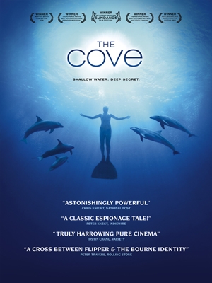
After reviewing the choice of possible project directions I decided to focus my outcome on whales/marine life. Before receiving the brief I had recently watched a documentary style film about the dolphin hunting practices in Japan. The film details the horrific procedure which sees thousands of migrating dolphins being trapped into a small cove where they are brutally massacred by fishermen with hooks, knives and spears. It is safe to say that the film was a source of thought for the next few days as the film portrayed horrific scenes of slaughter. As the film had such influence on me I decided that it would be a good focus for the project.  


IDEA DEVELOPMENT 

Once I had defined a focus for the poster I continued with the project by further developing a concept for the outcome. The mind-map below was used to help create a concept relevant to the project focus outlined above. 


POSTER FOCUSES;
  • Whales - multicoloured spray.
  • Dolphins - multicoloured spray.
  • Dull commercial fishing harbor.
  • Contrast ugliness of fishing with the marine life it destroys.  


POSTER CONCEPT 

After reviewing the ideas generated on the mind-map I quickly finalised a concept so I could start progressing with the projects development.


CONCEPT - Contrast the ugly monotony of the commercial fishing industry with the natural beauty of the marine life that it destroys. To achieve this I will create a print depicting a dull fishing harbor with a contrasting whale exhaling a bright multi-coloured spray.   


DESIGN DECISIONS 

After defining a project focus I progressed with outlining the project design decisions such as the colour scheme and stock that the outcome will be screen printed onto.


COLOUR SCHEME

As outlined by the concept the poster will visually contrast the ugliness of commercial fishing with the beauty of the marine life that it destroys. To achieve this I will display an image of a gloomy, dull commercial fishing harbor contrasted with the beautiful, bright spray from a visiting whale.
To achieve the desired aesthetic the colours scheme plays a vital roll, as to contrast the spray from the whale the print will have to be rendered in dull, uninviting colours. When choosing a colour scheme for the project this concept played a vital roll. 


STOCK

Moreover, as the outcome will be screen printed in preparation for the client a stock choice will also be defined. I went to the college library to review the choice of stocks available and selected a final paper named 'Antique'. 

The outlined stock stock has a matt finish and heavy GSM which helps to give the paper a quality, up-market feel. 


REFERENCE IMAGE

Below is the reference image I worked from when creating my illustration. 


INITIAL ILLUSTRATION

I started creating the initial illustration using the reference image of a commercial fishing harbor to help me compose the design. There were numerous aspects of the initial illustration that I wanted to improve as certain elements such as the wooden building did not turn out how I wanted them too. 


REFINED ILLUSTRATION


The illustration was traced and adapted to form the based of the design. 


CRITICISM

After completing the illustration and starting the initial stages of digital development I arranged a quick criticism with Joe Harrison to review the design and discuss the screen-print process.
I asked Joe to help me with critiquing the design as he has extensive illustration experience and will offer me informed and useful feedback.

CRITIQUE NOTES;

  • Crop to correct size for landscape screen. 
  • Change smoke from solid colour to texture applied to the sea. 
  • Print in dark colours so spray will stand out and contrast. 


RESPONSE

In response to the feedback received in the criticism I decided to change aesthetic of the smoke from a solid colour to match the pattern applied to the sea. I produced the illustration on a separate piece of paper so that it could be added to the design within illustrator.


DIGITAL DEVELOPMENT 

After the criticism I was in a position to start digitally developing the outcome in Adobe Illustrator. 


Live trace was used to make vectors from the hand rendered illustration. 


After creating vectors from the illustration and adding the refined smoke the composition was cropped to the A3 print dimensions. 


The image below illustrates what the outcome will look like after the screen printing process. 


PHYSICAL PRODUCTION 

After creating the digital version of the design I used the printing facilities available at university and created a set of prints. As outlined by the design decisions the poster was rendered in a colour pallet of dark greys to create the uninviting image of a harbor. Once printed, the design was ready for the addition of the multi-coloured spray. 

One improvement I would make if completing the project again would be to remove the registration marks used to align the individual layers of the outcome. Unfortunately, the alignment of the prints was still not perfect, even with the addition of the registration marks. Moreover, the placement of the marks also meant that the print had to be cropped right down to the edge of the design. By removing the registration marks I would remove the need to crop the print so close to the edge of the design, however this would also make it very hard to alight the layers of the outcome.


I used acrylic paint mixed with water to create the paint that will be flicked onto the design to create the whale's spray.


I also created a stencil to ensure that the flicks of paint did not cover the whole print and were contained within the desired section of the print.


Once paint had been added to each design they were laid out to dry.  


Once dry the process of cropping and numbering each print could take place. 


FINAL OUTCOME 

The image below document the final outcome. 


 ARTWORK DISSEMINATION

Once complete the prints were sent to the client via first class recorded post, the tube was sent two days before the store opening party to ensure that they arrived on time. Additionally, I also utilised a cardboard postal tube to ensure the prints were not damaged while being transported. 


Thursday 27 February 2014

DESIGN PROCESS 2 - COLLABERATIVE - CRITICISM

At the start of the session we were asked to get into the same groups that we presented our initial concepts to last session. Each group had around ten minutes to present the current progression completed since the last project presentation.

During the last session we presented our research and possible directions the project could be taken in. As the projects success largely relies on a creative, functional concept we devoted extra time to developing ideas. Therefore, to the critique we took a large range of initial concepts that explore the form and function of possible designs and selection of physical mock-up versions of our favorite concepts. 

A selection of the mock-ups presented.


After presenting, members of the group gave verbal feedback regarding our projects progression and current success. 


INITIAL FEEDBACK

I took note of any verbal feedback that we received;
  • Be careful to watch the scale of the outcomes, they need to be big enough to function but small enough to fit onto a desk.
  • We have developed a strong start to the concept and have a good potential range of outcome developed - the project is heading in the right direction.
  • Consider the packaging in more detail - how will the outcome be distributed?


After the initial presentations were completed we swapped projects with another pair from the critique group, critiqued their work in more detail and outlined a list of things that we would personally do differently if we were completing their brief. Moving anti-clockwise we got Danielle and Sam's WPP - environmental brief.


The pair had a string overall project, both the concept and target audience were well thought out and justified. However, some visual aspects of the project relating to colour schemes used and typography could be improved with some small adjustments. Our comments naturally reflected these criticisms in a constructive way.

Below is the feedback that we received during the second half of the criticism; 


FEEDBACK & ANALYSIS

Below I have made a list of what I believe to be the most definitive aspects of the feedback we received;


Doesn't highlight paper/stand alone enough - booklet idea;
  • The booklet doesn't showcase the paper - main focus of the brief.  
  • Although functional lacks aesthetic quality. 

Tints for each day of the week - Jake's design;
  • Idea relates to the functionality and aesthetics of the design - coloured tabs would help with the navigation of days and create an colorful aspect of the design.

Information on the back of each day card - Fedrigoni Logo calendar;
  • On the current mock-up of the Fedrigoni logo idea the back of the logo shaped sheet (displaying the date) is blank. Feedback suggests that it would benefit from the addition of relevant information on the back of each sheet.


Packaging must be well considered - relates to all possible outcomes; 
  • Another thing that was mentioned that I believe to be very important was the idea of packaging. The final idea that we choose to develop needs to have supporting packaging suitable for both display and distribution purposes.

Tabs for the Fedrigoni logo calendar are needed to help maneuver pages;
  • Feedback relates to the functionality of the concept - would need improving if selected for development.

Make folds larger to make more space for type - Jake's design;
  • Relates to the functionality of the design - problems like this should be solved during the developmental stages of the outlined designs production.

Change the form of Jake's idea to portrait, uses less desk space;
  • This comment relates directly to the functionality of the outcome in relation to the environment in which it will be displayed. As the outcome is being designed as a desk calendar it needs to be the right size as so it doesn't take up too much or too little space. 


ACTION PLAN

Finally, after reviewing and analysing the feedback we received during the session I created an action plan to help us stay organised while progressing from the criticism.


Wednesday 26 February 2014

DESIGN PRACTICE 2 - STUDY TASK 2 - CRITIQUE

At the start of the session we were spit into small groups to which we had around five minutes to present our current progression with study task two. 

The study task asked us to focus and finalise our research and prepare a mock-up version of the booklet that we are producing ready for the criticism. Unfortunately, due to the direction that my research has progressed in I haven't yet finalised my research to a standard where I can consider producing the booklet. 

During the criticism I explained the focus of my research so that members of the group could understand the decisions made regarding the form and aesthetics of the booklet. I presented a few mocked up pages with the introduction I have composed along side some illustrations. However this was far from final and served only as a way of visually communicating points about my aesthetic decisions.


After presenting to the group I noted down any feedback that was given. Furthermore, after everyone in the group had presented we walked round the table reviewing any booklet mock-ups and  giving further feedback.

The feedback sheet from the session is displayed below;


ANALYSIS

Areas for improvement;

Look at the art surrounding alchemy.

  • I have already looked at alchemy art in detail. However, as I did not present my research or a finished mock-up members of the critique group could not have known this.

Think carefully about the layout of the content - a consistent & easy to follow layout will help with the communication of information.

  • When designing my final outcome I plan to develop a range of layouts that will then be applied consistently throughout the booklet. However, before doing so I want all my type and image based content organised ready for placement, this will allow me to see how much content I am working with when composing pages. 


Play around with layout - modernise the design slightly to appeal to current readers.

  • The mock-up page spreads presented during the critique where displayed with the function of giving context to the type of aesthetic that the booklet will achieve. As the outcome will utilise alchemy woodcut prints produced over 300 years ago the aesthetic image created does look dated. Furthermore, this old-looking aesthetic  may not engage the modern audience that the outcome is aimed at. Therefore, I will apply refined modern layouts along side a hierarchy of modern typefaces to give the aesthetic a more modern appearance. 


Considerations;

  • You could hollow out the book by cutting individual pages - links to aesthetics - could make space to place ORMUS bottle.
  • The book could be hidden inside another book.
  • Use decorative fleuron type illustrations - Leo has a book containing some.
  • Think of ways the book could be packaged in relation to the booklets content.
  • Consider how to present scientific proof fairly and equally throughout the publication.
  • Consider applying finishing methods such as foiling and wax stamping.


RESPONSES

After receiving and analyzing the feedback I formed an action list of tasks to help me progress from the session. 


Tuesday 25 February 2014

DESIGN PRACTICE 2 - JACKSON RISING - TASK 1&2

At the start of the session we were briefed about the one day project that we were going to complete. After the briefing we were given a digital project pack containing all of the information about the task, the outlined body copy, logos and icons and a set of design limitations. 

When working in the design industry we will receive similar projects, with outlined limitations and a lack of design freedom that we often have when working on our own personal projects. Moreover, as we were already had all the visual props and body copy we were left to focus on composing the information and images in a functional, engaging way.

Below is the word document containing the project background, brief and body copy;


Like a real brief we were also set a collection limitations to consider while producing the outcome.

LIMITATIONS;
  • The flyer must be A5 and portrait.
  • All of the information such as the titles, date and copy must be induced on the final design.
  • The logos from all supporting companies must be included.
  • Only black and white may be used on the flyer.


FLYER

Below is the flyer that I produced in response to the first task.

Jackson Rising - Flyer.


CONCERTINA BOOKLET

After a short break we were tasked with producing a supporting concertina folding booklet for the event. Similarly to the task before we were given all of the logos, body copy and artist images, so the only task in had is to create a functional layout and produce the design.

Below is the word document containing the specifics of the booklets production;


When designing the booklet I had to consider a range of things to ensure that the design was successful and formed a strong visual theme with the flyer that was initially produced.


CONSIDERATIONS;

  • How will I balance the images and text to form a functional, flowing composition.
  • What typefaces form an appropriate hierarchy with the outlined 'Jackson Rising' logo.
  • How will I create consistency with the flyer to form a strong visual theme?
  • What graphics will be used to create a visually engaging final piece.

Below is the booklet that was produced in response to the second task;


DETAIL

Some shots showing the pages of the booklet in more detail;

Cover


First and second page.


Myame Kratz spread.


Jenny Dowd - Final spread.


Monday 24 February 2014

DESIGN PRODUCTION 2 - STUDIO BRIEF 1 - CONTENT ORGANISATION

CONTENT ORGANISATION 

After collecting a body of research into ORMUS and alchemy I started to analyse the collected information to see what data is needed to successfully educate users about the subject. The booklet will focus on the ORMUS substance, its history, uses and briefly reference the relevance of alchemy and how the two topics are linked.

Before I could start writing up the content for my outcome I first needed to analyse all research and highlight the areas of information needed to successfully introduce the outlined audience  to the research topics. 


IMPORTANT INFORMATION;

As I reviewed the research collected for the project I noted down important points of information and organised a rough content, this was an essential part of the project as I was limited to using 16 pages. Therefore careful consideration was given to define information essential to successfully understanding the subject matter.


Next, I analysed the content list and created a more detailed version that lists individual aspects of information that will be included in each section. 


Disclaimer;

  • Outlining that there is no institutionally directed research supporting claims.
  • Information for educational purposes only. 
  • Use the book as the basis for your own focused research.


An Introduction to Ormus;
  • Introduction - Definition/explanation of what ormus is.
  • Varying terminology used - ORMUS, ORME, The Philosophers Stone, Manna.
  • David Hudson - Briefly introduce re-discovery.


Ormus History;
  • The modern day discovery of ORMUS
  • Historical usage - Ancient Egypt, Greece, biblical.


Ormus & Alchemy;
  • Introduction to alchemy.
  • Alchemical practice - spiritual process, enlightenment, metal transmutation. 
  • Ormus & Alchemy link - Philosophers stone - helps reach enlightenment. 


Ormus uses & applications;
  • What it is believed to do in detail - spiritual, physical, mental. 
  • Ormus material properties - levitation, resistance to magnets, change in weight. 
  • Dangers of taking ORMUS - research not all there - no institutional research.


Scientific Support;
  • Introduction - biased/unbiased information, why there is no institutional research. 
  • Supporting scientific data/research.


Conclusion;
  • Brief summary of information.


CONTENT WRITE-UP

After forming the list of points and information that the booklet will cover I started writing up the content, using the list displayed above as a writing guide. Once completed I was in a position to start digitally rendering my booklet.

Due to the extensive nature of the research topic I found it very hard to summarise all of the important aspects of research needed to completely understand the challenging topic. Therefore, once I had finished writing the content to a satisfactory level the word count came to just over 4000 words. Fitting that much content into my 16-page booklet could pose a challenge, especially when I am aiming to create an engaging layout formed from a balance of text and imagery. 


Once I had finished writing the content I went through the text and highlighted information essential to the successful understanding of the topics covered by my research. The final word count of the highlighted text came to 2304.


CONCLUSION